Form and function innovators in architectural design

From the sails of the Sydney Opera House, the curves of the Empire State Building, the soaring spire of the Oriental Pearl Tower in Shanghai or the uplifting dome of St Pauls Cathedral, the world is full of iconic buildings that broke moulds, drove innovation and inspired new buildings around the world. Great names like Foster, Gehry, Utzon, Wren and Eisenman are at the forefront of architectural design for their time, changing the way we live and the buildings we live in.

There are many architects that have inspired, innovated and changed the landscapes of cities around the world. Here are three that innovated by developing structures where form followed function.

I.M.Pei

Pei was born in China, raised in Hong Kong and educated in the US. He adapted the famous adage form follows function and made it his own. He believed form follows intention and intention incorporates function.

Pei came to prominence when he won the commission to design the John F. Kennedy Presidential Library and Museum not long after Kennedys assassination. He is probably best known globally for the glass pyramid that sits at the entrance to the Louvre Museum in Paris. Other notable Pei works include the East Building of the National Gallery in Washington D.C. and the Museum of Islamic Art in Qatar. His style is characterised by geometric shapes (famously pyramids), plain surfaces and natural light.

Zaha Hadid

Born in Baghdad, Iraq but spending much of her life in London, Zaha Hadid was the first woman to win the Pritzker Prize (https://www.pritzkerprize.com/ ) in 2003.

Dubbed the Queen of the Curve, Hadid used curving facades, sharp angles and unbending materials like concrete and steel to create structures that appear soft and sturdy at the same time. The Guardian said that she had liberated architectural geometry, giving it a whole new expressive identity.

Many of her projects transform shape depending on the viewers perspective. This includes her Heydar Aliyeve Cultural Centre in Baku, Azerbaijan with its swooping faade that undulates like a sheet of graph paper.

Another famous structure is the London Aquatics Center, designed for the 2012 Summer Olympics. Demonstrating her signature undulating form, the roof also has cut-outs that allow natural light to filter in and shine across the pool.

Highlights of her work include the Michigan State University’s Broad Art Museum in the US; the MAXXI Museum in Rome; the Riverside Museum, part of the Glasgow Museum of Transport, the Beijing Daxing International Airport in China and the Al Wakrah Stadium in Qatar.

Ole Scheeren:

German-born Ole Scheerens work is challenging how we see residential blocks. He says that he designs with out of the box thinking while confronted with constraints.

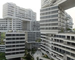
Scheerens work includes the Interlace in Singapore, a 1000 apartment project that was limited by land size and height restrictions. His answer was to build a series of 24 straight buildings that were stacked on top of each other like a Jenga game. The project ultimately created more green space than it used up.

Scheeren believes that architecture is about storytelling. Good Architecture should be able to narrate stories he believes. The Interlace represents Singapore, a city-state that has solved problems with innovative thinking and works together in a collaborative way for mutual success.

His other famous works include the CCTV Headquarters, d kch (or the Big Boxer Shorts) in Beijing, and the MahaNakhon, Thailands tallest tower.

All three of these architects pushed the envelope of form while delivering buildings that are functional, intentional and in some cases seem to challenge gravity. While both Hadid and Pei have gone, the torch has been passed to a new generation of architects and their buildings stand testament to resilience, form and function.

Celebrating Industrial Design: Three Elements Of Great Design

Think about warehouses, exposed brick, beams and formwork, metal roofing and wood flooring that bears the marks of time. You’ve probably already got the exact image in your head. When did this style weave its way into our psyche? Is there a name for it?

There is, and the school of Industrial Design is as prevalent in modern design, if not more than it ever has been. Whether it’s the details of the industrial styling that seem slightly misplaced, or the unabridged rawness to the materials there is a magical quality to industrial design. In combining these elements, it becomes a stunning way to mix modern design with ageing materials to create a look that is sophisticated.

The elements of the style surround us today and aren’t just limited to inner-city loft-style apartments, but office spaces, public seating areas and break-off spaces. As we celebrate Industrial Design Day, we look at three factors that contribute to the style’s status.

Simplicity & Minimalism

In removing clutter from an industrial space, you begin to see the beauty of the details. The reason the industrial design is so popular is that it evokes a sense of calm and minimalism, so heavy, bulky furniture and knick-knacks are best avoided. While a centrepiece is excellent and will look great when carefully considered, it’s better to avoid using too many interior products and fittings as they create a look than is overbearing. The design should welcome movement and space, so it’s essential to respect this notion when designing.

Modern Industrial

When balanced with carefully selected modern fittings, industrial design elements always look great. Combine a rustic style with shiny metals, use hanging lights, wrought iron, brass fittings, brushed nickel or a wooden island that tells a story. It all offers a contemporary twist and will transform your space. Disregard the fact that the elements came from a different era, play with them and create exciting contrasts that stand out.

Rough, Stressed & Unassuming

The premise of industrial design lies in its celebration of materials that would usually be disregarded. The style is not about shinier or brighter; it’s about creating a raw look that doesn’t have an ‘off the shelf’ feel. Think ageing metals, stressed fabrics and matte finishes. Combine metal with wood to create interesting contrasts that create a lasting effect. These materials, when combined, can make old materials look entirely new, and freshen an entire space.

If you’ve found yourself admiring warehouse conversion you’ve seen online or the exposed brick at your favourite coffee shop, maybe it’s time to bring some industrial design into your own space!

A bluffers guide to architecture

Every profession has its jargon, a language of its own that allows its practitioners to talk shop, often to the exclusion and annoyance of lay persons. On the other hand, without a few technical terms business of any kind would be impossible to conduct.

To illustrate, do you know that Gracie Fields song that goes Im the girl that makes the thing that drills the hole that holds the spring that drives the rod that turns the knob that makes the thing-ummy-bob as featured in recent TV advertising for Square, the credit company?

It was a war time favourite that celebrated the role of women factory workers. Amusing, yes. But can you imagine engineers specifying components without the use of such handy terms as cotter pin, sprocket wheel, flange nut, ratchet and pawl etc?

Its much the same with architecture. There comes a time when that bit that goes round the frame of a door or the upright bar that separates two adjoining windows gets a bit cumbersome and confusing, hence the terms architrave and mullion to describe each respectively.

So, to mug up your architecture (and impress your dinner party friends when discussing your new homeextension) heres a handy A-Z (or bluffers guide!) of architectural terms you can drop into conversation. Theyll also get your architect to look at you with new found respect and be wary of blinding you with science!


Not that we at SKK would ever do anything like that of course hence the lexicon below:

An A-Z of Architectural Terms

ARCHITRAVE
BRISE SOLEIL
CHAIR RAIL
DADO
ENFILADE
FANLIGHT
GOLDEN RATIO
HAUNCH
IONIC
JOIST
KEYSTONE
LINTEL
MULLION
NOGGING
OCULUS
PELMET
QUOIN
ROTUNDA
SASH
TRUSS
UNDERCROFT
VOUISSOIR
WING
XYST
Y NOT CHOOSE SKK DESIGN?
ZIGGURAT


Buildings that went wrong and what we can learn from them

Its been said that someone who never made a mistake never made anything. And that goes as much for designers even famous ones as it does for anyone else. If you learn from your mistakes failure can be a foundation for success. Of course its better, when you can, to learn from the mistakes of others, and as designers ourselves you can be sure weve taken the following object lessons to heart.


Leaning Tower of Pisa

Uniquely amongst architectural failures the Leaning Tower of Pisa is a success because it is a failure! Its wonky design makes it one of worlds best known landmarks and tourist destinations. Its famous tilt is the result of bad foundations, with ground too soft on one side to support its weight. It had been inching towards collapse since the 12th century, but was stabilised by a 20th century rescue project. Health and Safety doesnt appear to be an issue even today: the guard rails on the top viewing platform only extend half way round and guess which side theyre on? Yep, the side that tilts up!


Secret Intelligence Service Building


The SIS building is Londons spook central, HQ of M15 and M16 and the Circus of

Le Carres George Smiley. The building is structurally sound and can claim to be both impressive and distinctive some have compared it to a Mayan temple. But be that as it may, isnt it a bit ostentatious and attention seeking for a secret organisation? Its like the Masons holding an open evening or the Magic Circle giving show and tell demonstrations! An underground bunker would be more fit-for-purpose in architectural terms. But maybe its a clever double bluff?


Walkie Talkie Building


The London skyline is peppered with landmark buildings such as the Gherkin, the Cheesegrater and the Shard that are hailed as architectural triumphs or disasters depending on your point of view. Amongst these is the Walkie Talkie, so called because it looks like one. In 2015 it was awarded the Carbuncle Cup for the worst new building in the UK in the previous six months. But Health and Safety is also an issue here. The curved mirrored frontage of the building focuses sunlight on to local streets, damaging parked vehicles and scalding passersby. One journalist even highlighted the problem by frying eggs on the street!


Sydney Opera House


An unlikely candidate for a gallery of architectural failures you might think, the Sydney Opera Houses sail-like design is a subject of national pride and international acclaim. Surprisingly for a structure designed as a concert venue, a major problem turned out to be its acoustics! It was decided that the small sail part of the complex would be the opera house and the large sail part would be the concert hall. Unfortunately the concert hall was too big to fill for most events and the opera house too small for musicians to hear themselves. A multi-million dollar refit was undertaken an expense that fitness-for-purpose planning could have prevented.


Millennium Dome


The problem with Londons Millennium Dome was not so much that it was unfit for purpose than that it didnt have a purpose at all other than to mark the Millennium and be a vanity project for New Labour. It turned out to be little more than a big top for a circus with an acrobatic cast of 160. It cost nearly 800 million, attracted only half of the anticipated 12 million visitors in the first year and closed shortly afterwards. A stadium for Charlton Athletic and a high-tech business park were amongst the after uses considered for the dome before it was finally redeveloped as the O2 Arena in 2007 with a concert by the rock band Bon Jovi.


Houses of Parliament


The Houses of Parliament are not so much an architectural mistake as a disaster waiting to happen. The original Palace of Westminster, home of the Kings of England, was destroyed by fire in 1512. It was replaced by the Old Palace, which was destroyed by fire in 1834. The existing New Palace built in the Gothic Revival style by Charles Berry is now once again considered a serious fire risk and plans are afoot for both houses to vacate the building for a major refurbishment expected to take six years and cost 3.5 billion. Which goes to show that the design team must keep abreast of advancing technology and increasingly stringent building standards.