Not just up: Skyscrapers of the future

The United Nations predicts that by 2050, 68% of people will be living in a city. With land increasingly precious and expensive, the natural alternative is to look at what living in a vertical world would look like.

Some cities around the world have embraced the skyscraper world, with spectacular skylines to match Seoul, Moscow, Hong Kong, Mumbai and So Paolo feature the most skyscrapers.

The UK is no exception to this trend with famous new buildings such as the Shard in London and Manchesters City Tower.

50 years ahead of its time

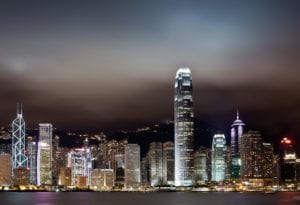
One great global example ahead of its time, was conceived in the 1970s by Norman Foster and built in the 1980s. The HSBC office One Queens Road was designed help people move around the building in a more lateral way, bypassing lifts as the primary carrier of people in the building. Lifts access certain floors while a web of escalators connect the remaining floors. Its most famous feature is how it maximises natural sunlight as a major source of lighting inside the building. At the top of the multi-level internal atrium (enabled by the buildings lack of internal supporting structure), mirrors reflect natural light down through the atrium into the plaza on the ground floor. External sun-shades control the amount of sunshine that goes into the building, important for climate control, especially in such a hot climate. In an early nod to green energy, the air-conditioning units are cooled by sea water, an abundant resource in the region.
Going green around the world

Breaking ground in 2020 is the Southbank by Belulah in Melbourne Australia. Decided by competition, the design includes biophilic design elements. The two towers (102 stories and 59 stories respectively, making Tower 1 the tallest building in Australia on completion) are designed to twist around a green spine of vertically networked platforms and outdoor areas like terraces and verandas. It should result in not only amazing city views and internal light but improves the contextual links within and between the two buildings.

Green skyscrapers have proliferated around the world: from the Park Royal on Pickering Hotel in Singapore, to Milans Bosco Verticale, to Shanghais Shanghai Tower and even Hemel Hempstead.

The Bosco Verticale has green plants that will grow up the building over time. These are not only ascetically appealing but trap dust, absorb CO2, act as a cooling agent and release oxygen. This is an element that is being increasingly included in skyscraper design.

The Shanghai Tower meanwhile uses green technology to future-proof itself, with rooftop wind turbines, rainwater collection and grey-water systems, dual-layered insulation and many energy-saving features.

The Beacon in Hemel Hempstead, a residential property, is being designed to use less than 80% of heat and electricity of a standard residential block. Each level of the building has a solar-ledge of solar panels. The power generated from these combined with energy derived from the heat of the building should lead to residents of the building getting free electricity and hot water for up to five years. Further innovations such as harvesting heat from shower water, collecting grey water and rain water for clothes washing and flushing toilets as well as automated parking that will be seen in this building seem to be the way of the future for skyscrapers, indeed buildings of all kinds.

All of these buildings prove that going up doesnt always lead to isolation or linear, vertical living and working spaces. Interconnectivity, green and climate saving features and a connection to nature are still possible, even spaces in the sky.
From little things big things grow: Celebrating mechanical pencil day

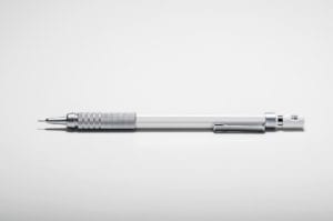
Next time youre using a pen, glance down and observe its design.

Chances are youve never done this before.

Observe the interplay between its form, function, and shape, the care that has gone into an object most of us use without thought daily.

The same could be said for any object lying around the home or officeand more often than not, you will have never bothered to inspect them. They just work or not.

When we started our careers, architects and technicians work white coats, with a thick, grey streak of lead shavings across their midriff from the constant sharpening of mechanical pencils long, plastic and steel clutch pencils that were an essential tool in draughting designs prior to committing pen to (tracing) paper. The pencils were a personalised companion of our profession, constantly needing adjustment via sharpening boxes uniformly bolted to desks. A fusion of product design and architecture.


Some of the best architects of the last century had dalliances in product designFrank Lloyd Wright and Mies van der Rohe were incredibly passionate about chair design. At the same time, Britains own Jony Ive, Chief Design Officer at Apple, began his career as an architectural designer. The overlap between the two has grown increasingly fluid, yet the design guidelines remain the samegreat design will always speak of practicality, simplicity and innate intuitiveness.


This concept can be seen in the dismantling of every single product we usejust like the pen you write with, the phone in your pocket and the chair you sit onthere is always a constant thread of purity and simplicity of manufacture in almost every piece.


As time passes, the transference of knowledge between architects, interior designers and product design will growwhich will only lead to even more daring design adventures.


So next time youre using your pen, consider its form, its aesthetics and function, and all of the decisions that passed in it coming off the production line. We may not use the mechanical pencil much these days, but the link between architecture, design and our everyday lives is as strong as ever.

A LESSON FROM THE ANCIENT GREEKS: BALANCING BAD ACOUSTICS

Considered pioneers of acoustics and sound travel, the Ancient Greeks used their in-depth knowledge when designing the stunning amphitheatres that still stand today. It’s a shame their designers aren’t still working, as some contemporary spaces will overlook acoustics, as it’s often viewed as a ‘cost option’.

However, excellent acoustics don’t need to be expensive, especially when they’re integrated at the beginning of the design process.
Poor acoustics aren’t just annoying, they are often unhealthy and can impact aspects of work-life – including productivity and concentration, staff wellbeing and a diminishing a sense of privacy. And as the shift from traditional, cellular offices to collaborative, agile spaces advances, the importance of considering resolved acoustic systems is more relevant than ever.

As we celebrate Save Your Hearing day for 2020, we discuss ideas for improving acoustics in modern workspaces.

Productivity

We are all affected by noise – and not always in a bad way. A sense of thrumming activity, being part of a lively atmosphere can often be a good thing and raise your sense of being in a working neighbourhood. In certain areas this should be designed in, via not only the layout but choice of furniture systems and heights, finishes and materials and so on. However, when you are researching intricate details, or reading through legal documentation, CVs and the like that require your full concentration it is likely that you will need a much lower level of ambient noise. The same is often true of Meeting rooms, client waiting areas including reception. The acoustic design isn’t just layout, but also methods of construction, services design and appropriate use of materials.

It’s often the case that employees will continue to work without realising that noise is actually affecting them.

When creating a space, encourage a holistic approach and consider the comfort and possible needs of the employees that will be using the environment. Do you have an older workforce? Create an appropriate design that won’t compromise the natural work style of an older generation who may prefer to work individually. Is there a particular group of your employees that spend more time speaking over the telephone? Consider appropriate seating arrangements too.

So next time you’re considering the design of a space, consider acoustics too – and at an early stage. Your team will love you for it, as will the Ancient Greeks!

CONSERVATION OR DESECRATION? THE REMAKING OF LONDON LANDMARKS

When it comes to architecture, are you a modernist or a traditionalist? Do you side with Norman Foster, creator of London’s ‘Gherkin’, the headquarters of the Swiss Re insurance company, or Prince Charles, the squire of Poundbury, the classically styled model town in Dorset?

The latest battle in the war between modernists and traditionalists is the condemnation (or commendation, depending on your point of view) of ‘Facadism’. Facadism is about keeping the facade of a (usually historic) building, demolishing everything behind it and building something else in its place.

Some of the more striking examples in London include the National Provincial Bank, Threadneedle Street, and the London Fruit and Wool Exchange, Spitalfields, both of which now look like studio flats in a Hollywood back lot.

Is this conservation or desecration? Such buildings are the very fabric of our architectural heritage and are presumably protected by a preservation order. But couldn’t the whole building have been repurposed without demolishing all but a modesty screen for an incongruously mismatched building behind it?

Isn’t this just conservational tokenism on the part of developers and planning authorities – done in the name of expediency, profit and inflated business rates? Or should we be grateful that any vestige of the original is preserved at all? When a building is demolished in entirety, it often seems that something less architecturally distinguished is erected in its place.

Is the rise of Facadism an admission of defeat? An acceptance that quality architecture is a thing of the past? We mentioned Norman Foster as a proponent of modernism, and love it or loathe it, his ‘Gherkin’ is a stunning example of his style. As one journalist said about it when it was built: If at least one scene of the next James Bond film isn’t set there, I’ll eat my hat!

But actually Norman Foster’s redesign of the British Museum and its new interior courtyard is proof that enhancement of period architecture can by handled sympathetically and well. The graceful steel and glass canopy of the courtyard both respects the classical architecture of the original building and provides a gentle counterpoint to it.

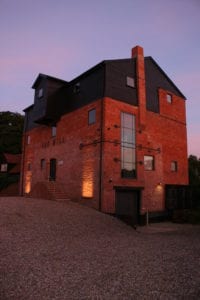
Whilst we wouldn’t necessarily put ourselves in the same class as Norman Foster, we at SKK believe that a harmonious blend of traditional and modern can be achieved in the restoration and repurposing of period buildings, a policy we have followed in refurbishing our own offices from a former Victorian flour mill.

Sustainable design: Six ways to grow the green pound

From small scale renovations to major construction projects, sustainability has become a significant factor in design, specifying, refurbishment and construction methods. Thankfully, there are many green options on the market when deciding upon appropriate products and materials, and as architectural designers we at SKK are well placed to advise you on the best options for your project.

BREEAM, based in the UK, is one of the worlds leading sustainability assessment organisations.

Abuilding or development that has attained a BREEAM rating will have enhanced market value. In the same vein, designing sustainability into your property, no matter its scale, makes financial sense.

Here are six popular and value-enhancing examples of sustainable design:


  • Rainwater Harvesting. A straightforward and practical way to reuse natures gift. Services design enables rainwater to be stored and used for WC cisterns, washing machines, irrigation etc. Retrofitting is an option in many cases.


  • Harnessing Solar Energy. Simple to retrofit, the technology has advanced enormously in recent years with the introduction of smaller panels (including direct replacement for roof tiles), reducing supply and fitting costs.


  • Green Roofs and Walls. Bring little gardens to inner city areas, encouraging more bees, butterflies and plant growth. Benefits include reduced rain run-off, thermal and noise insulation, and improved air quality.


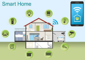
  • Intelligent Lighting Systems. Built-in or retro fitted, these offer a seamless transition from manual to automated control as and when needed. Energy saving, affordable and wireless. Can be operated from phone or tablet.


  • Natural Ventilation. Reduces energy consumption and creates effective ventilation through a system of openings using pressure differences between the inside and outside of the building induced by wind and air temperature.


  • Biofuels. Considered to be one of the most efficient sources of electricity, biofuels are fast becoming a viable alternative to fossil fuels. Increasing numbers of office buildings use biofuels to reduce costs and carbon footprint.


To read more about the Most Sustainable Office Buildings in the World click here.

A STYLE BIBLE FOR HOME AND BUSINESS MAKERS

At SKK Design we are passionate about design. It’s what gets us up in the morning and keeps us in the office late at night. Whether we are working on an office, restaurant, private residence or retail store we love to create inspiring and innovative designs from clients’ visions.

It’s often said that style is easy to recognise but hard to define. Well here’s an overview of some of the more popular architectural styles. Which suits you?

Minimalist

Design Elements: uncluttered, clearly defined shapes and spaces, simple palettes without adornment, concealed services.

Purpose: maximising usable space in an environment that is easy to live within.

Industrial

Design Elements: An emphasis on visible engineering and functionality often featuring exposed structural members and services.

Purpose: Use of raw materials to provide prestigious yet practical building solutions.

Scandinavian

Design Elements: simple, spare interiors maximising the use of natural light and natural materials, including pale softwoods, statement furniture and rugs.

Purpose: to evoke the feeling of being at one with nature in a calming environment.

Contemporary

Design Elements: a pick and mix of 20th & 21st century styles referencing iconic designs of the past. Favours a neutral palette with clean lines and organic shapes.

Purpose: not to be confused with ‘modern’ but staying true to modern thinking.

Traditional

Design Elements: elegant, of the period, classic detailing and proportions, traditional use of materials and craftsmanship, ornate.

Purpose: grandiose, respectful of history, homely and classy.

Bohemian

Design Elements: a random blend of cultural references, bold and striking in both palette and texture, often with earth coloured hues as a backdrop.

Purpose: to be free of convention, a daring exploration of eclectic style.

Rustic

Design Elements: oversized components, natural materials such as stone, timber and terracotta with natural or aged finishes and simple detailing.

Purpose: to give a sense of simplicity and use timeless rather than modern materials.

To learn more about each design concept and its characteristics keep visiting our website, we’ll be featuring each of these concepts in more detail in our future blogs.